
Discover proven website conversion optimization strategies for 2025. Learn how to improve CTAs, optimize forms, and design pages that turn visitors into paying customers.
Introduction
Your website gets traffic. You’ve invested in SEO, run paid ads, and built a social media presence. Visitors are coming. But here’s the frustrating part: they’re leaving without buying, signing up, or contacting you.
If this sounds familiar, you’re not alone. The average landing page conversion rate is just 2.35%, meaning 97.65% of visitors leave without converting. That’s not just a missed opportunity. It’s lost revenue, wasted ad spend, and potential customers going to competitors instead.
The good news? Small, strategic changes to your website can dramatically improve these numbers. This is called Conversion Rate Optimization (CRO), and in 2025, it’s the difference between businesses that struggle and those that thrive.
This guide reveals the latest conversion optimization strategies based on current research and real-world results. You’ll learn practical tactics to improve your CTAs, optimize forms, and design pages that actually convert.
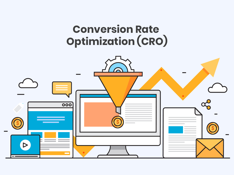
Understanding Conversion Rate Optimization
- Making a purchase
- Filling out a contact form
- Signing up for a newsletter
- Downloading a resource
- Booking a consultation
Why Conversion Optimization Matters More Than Ever
Studies show $2.6 billion in sales are lost annually due to slow websites, and users make snap judgments about websites in less than a second. In 2025’s competitive landscape, you have milliseconds to make an impression and seconds to prove value.
Customer acquisition costs keep rising. Paid advertising gets more expensive every year. The most cost-effective way to grow isn’t attracting more traffic. It’s converting more of the traffic you already have.
Additionally, modern consumers have an attention span of just 8 seconds in 2025. Your website needs to capture attention, communicate value, and guide visitors toward conversion faster than ever before.
The Foundation: Website Speed and Mobile Optimization
Before optimizing CTAs and forms, fix your foundation. Studies show nearly 70% of online shopping carts are abandoned, and slow load times are a major culprit.
Page Speed Optimization
Page speed is a conversion killer – studies show a one-second delay in page load time can reduce conversions by 7%. Every second counts.
Action steps:
- Compress images without losing quality
- Minimize CSS and JavaScript files
- Enable browser caching
- Use a content delivery network (CDN)
- Target load times under 3 seconds
Mobile-First Design
Over 54% of e-commerce traffic comes from mobile devices. If your mobile experience is clunky, you’re losing more than half your potential customers.
Mobile optimization checklist:
- Responsive design that adapts to any screen size
- Touch-friendly buttons (minimum 44×44 pixels)
- Simplified navigation for thumb-reach
- Mobile-optimized checkout flows
- Optimizing CTAs for mobile devices can improve conversion rates by 32.5%
Mastering Call-to-Action (CTA) Optimization
CTA Placement Strategy
Placing the CTA button at the end of the product page can increase conversions by 70%. But one CTA isn’t enough. Modern high-converting pages use multiple strategic placements: Above the fold: For immediate action from ready-to-buy visitors Mid-content: After establishing value proposition Bottom of page: Final opportunity before exit Removing navigation menus from landing pages can double your conversion rate by eliminating distractions and keeping focus on the primary CTA.CTA Copy That Converts
Generic CTAs like “Submit” or “Click Here” don’t inspire action. Using a specific, clear CTA can increase conversion rates by 161%. Weak CTA: “Submit” Strong CTA: “Get My Free Website Audit” Weak CTA: “Learn More” Strong CTA: “See How We Increased Client Revenue by 280%” The best CTAs:- Use action verbs (Get, Start, Discover, Unlock)
- Communicate clear value
- Create urgency when appropriate
- Speak in first-person (“Get My Free Guide” vs “Get Your Free Guide”)
CTA Design and Color
Changing the color of the CTA button can increase conversions by 21%. Your CTA button should:- Contrast sharply with surrounding elements
- Be large enough to notice easily
- Increasing the size of the CTA button can increase click-through rates by 90%
- Use whitespace to make it stand out
Adding Urgency
Adding urgency to CTAs, such as limited-time offers, can increase conversion rates by 332%. Phrases like “Limited Time Only,” “Only 3 Spots Left,” or “Sale Ends Tonight” trigger fear of missing out. Use urgency honestly. False scarcity damages trust and hurts long-term conversions.Personalization Power
Personalized CTAs perform 202% better than basic CTAs. Show different CTAs based on:- Visitor source (organic, paid, referral)
- Previous behavior (return visitor vs new)
- Geographic location
- Device type
Form Optimization: Reducing Friction
The Rule of Minimal Fields
Unbounce found that reducing form fields from four to three could boost conversions by up to 25%. Ask yourself: is this field absolutely necessary right now? What you need:- Name (first name only may suffice)
- Phone (if calling is part of your process)
- Company name
- Address
- Job title
- Multiple contact preferences
Form Design Best Practices
Make forms feel effortless:- Use single-column layouts (easier to scan)
- Clearly label all fields
- Show inline validation (immediate feedback on errors)
- Use progress indicators for multi-step forms
- Auto-fill where possible
- Make it obvious which fields are required
Form Placement
Keep forms simple and use color and whitespace to visually set the CTA apart from form fields. Your form should:- Be prominently placed above the fold for important conversions
- Have a clear, benefit-driven headline
- Include microcopy explaining what happens after submission
Design Elements That Convert
Trust Signals and Social Proof
93% of consumers trust customer reviews just as much as recommendations from friends. Display:- Customer testimonials with real names and photos
- Trust badges (secure checkout, money-back guarantee)
- Client logos from recognized companies
- Real-time social proof (“Sarah from Boston just purchased…”)
- Industry certifications and awards
Visual Hierarchy and Directional Cues
Use visual hierarchy to guide the eye from headline to CTA naturally. Strategic use of:- Size (larger = more important)
- Color (contrast draws attention)
- Arrows or other directional elements
- Eye gaze in photos (people looking toward CTAs)
- Whitespace to reduce clutter
Value Proposition Clarity
People want to know what they’re getting into – the more specific you are about what happens after the click, the more likely they are to take immediate action. Your value proposition should answer:- What do you offer?
- How does it solve my problem?
- Why should I choose you over competitors?
- What happens after I click?
The Power of A/B Testing
What to Test
Even small tweaks can lead to big wins – changing the placement of a form or simplifying copy can significantly boost conversion rates. Test these elements:- Headline variations
- CTA button color and text
- Form length and field labels
- Page layout and element placement
- Images vs videos
- Trust signal positioning
Testing Best Practices
Test one variable at a time to isolate what’s impacting performance. If you change both the headline and CTA color simultaneously, you won’t know which change drove results. Run tests long enough to reach statistical significance – avoid drawing conclusions too early. Most tests need at least 1,000 visitors per variation and 2-4 weeks to produce reliable results.Mobile-Specific Conversion Optimization
- Larger, thumb-friendly buttons
- Click-to-call functionality prominently displayed
- Simplified navigation (hamburger menus)
- Single-column layouts
- Minimize typing requirements
- Offer mobile payment options (Apple Pay, Google Pay)
Checkout Optimization
- Offer guest checkout (don’t force account creation)
- Simplify form fields to only essentials like name, shipping address, and payment
- Display security badges near payment fields
- Show progress indicators for multi-step checkouts
- Save cart contents for returning visitors
- Include multiple payment options
- Display total cost early (no surprise shipping fees)
Common Conversion Killers to Avoid
These mistakes destroy conversions:
Too many CTAs on a single page can overwhelm and confuse users. Focus on one primary action per page.
Poor contrast and visibility – ensure CTAs are visible against the website’s background.
Ignoring user journey – pushing for a sale before the user has enough information leads to higher bounce rates.
Pop-ups that appear immediately and block content frustrate visitors.
How SmartHire Technologies Improves Conversions
- Comprehensive conversion funnel analysis
- A/B testing strategy and implementation
- CTA and form optimization
- Mobile UX improvements
- Speed optimization
- Heatmap and user behavior analysis
Conclusion: Small Changes, Big Results
Improving your website’s conversion rate doesn’t require a complete redesign or massive budget. Sometimes the best approach to writing calls to action is to test out several variations – even small changes can make a big impact on conversions.
Start with your foundation: fix page speed and mobile experience. Then optimize your CTAs, simplify your forms, and add trust signals. Test everything. Measure results. Iterate continuously.
Website optimization is an ongoing process, not a one-time project. The most successful businesses continuously test and refine, always looking for that next improvement.
Ready to turn more visitors into customers? Schedule a free conversion optimization consultation with SmartHire Technologies. We’ll analyze your website, identify quick wins, and create a strategy to boost your conversion rates. Contact us at +91-9217212040 or info@smarthiretechnologies.com.